A dithering trick hides a full photo inside a scannable QR code
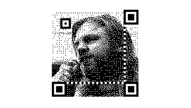
The article starts from a QR code the author saw on Mastodon that looks like a noisy photo rather than the usual black-and-white grid, and works through how it was made. A QR code splits into function patterns (the bold shapes a scanner uses to locate the code) and data modules (where the actual bytes live); once the scanner has used the function patterns to find the code, the data modules can be nudged a fair bit before the code stops scanning. The technique behind the Mastodon image, credited to a person named Dave, subdivides each QR code pixel into a three-by-three grid, using the centre cell to store the real data bit and the surrounding eight for a photo, producing a low-res, one-bit image with salt-and-pepper noise. The article then explains the dithering behind it. Simple thresholding just makes dark pixels black and light pixels white; Floyd-Steinberg dithering instead thresholds each pixel left to right and top to bottom, then "diffuses" the resulting brightness error into the neighbouring pixels that have not been thresholded yet, so the image averages out closer to the original tones and the pattern looks less mechanical than a plain checkerboard (Bayer) approach. Ordinary Floyd-Steinberg dithering keeps that error under 50%, because the pixel colour is chosen freely. QR code data modules are different: their colour is fixed by the encoded data, so forcing one of them, say a dark-area pixel that must be pure white, can create an error as large as 95%. The fix described is a two-pass version: pass one forces every data-module pixel to its required colour and diffuses that (potentially huge) error into its eight neighbours; pass two runs the normal Floyd-Steinberg diffusion over the rest of the image. Doing the data-module pass first is what keeps the salt-and-pepper noise from standing out and produces a substantially cleaner image than the naive method. The linked generator tool adds a few extra options on top: rotating the QR code before the photo is embedded, trying alternative QR encodings to see which looks best, and optionally letting the generator change a handful of the highest-error data-module pixels, using the error correction QR codes already carry (the same mechanism that lets codes have a logo in the middle). According to the article, allowing those changes barely affects image quality once the data-module error is being diffused, but it does noticeably hurt how reliably the code scans. The piece closes on the practical limits: the technique works well for a code on a screen or a poster, but a QR code needs its full margin and error-correction robustness to keep scanning if it might end up crumpled on a printed flyer or read by a cheap phone camera in bad light, so there is a real trade-off between how good the code looks and how reliably it scans. It also flags that the generator's output images have no margin, and that browsers will blur them on upscaling unless that is disabled in CSS, plus that an inverted QR code needs a black background rather than white behind its finder squares.
Key facts
- The technique subdivides each QR code pixel into a three-by-three grid, storing the real data bit in the centre cell and using the other eight cells for a low-res, one-bit photo.
- Standard Floyd-Steinberg dithering keeps brightness error under 50% because it can pick any colour for a pixel; a QR code data module has no such freedom, so forcing its fixed colour can create up to 95% error.
- The generator's fix is a two-pass error diffusion: first force the data-module pixels to their required colours and diffuse that error, then run normal Floyd-Steinberg dithering over the remaining pixels.
- The example dithered QR code is a 147x147 pixel one-bit image, in which one in nine pixels are data modules carrying effectively random colours rather than photo detail.
- The generator can also let a few of the highest-error data-module pixels be changed outright, relying on QR error correction, but the article says this barely improves image quality while noticeably hurting scan reliability.
Why it matters
It is a clean worked example of exploiting a format's own tolerance for error: QR codes are built with heavy error correction so they still scan when scuffed, printed badly, or partly obscured, and this technique spends that slack on making the code look like a photo instead. The two-pass diffusion idea, force the mandatory pixels first and diffuse their error before doing normal dithering on everything else, is a reusable trick for any case where some pixels in an image are fixed and the rest are free.
Who it affects
Anyone who wants a QR code that looks distinctive rather than like a generic black-and-white grid: designers putting a code on packaging or a poster, hobbyists experimenting with image processing, or developers curious about how brand QR codes with logos or photos embedded in them are actually built.
How to use it
The article links a generator tool that builds these codes from an uploaded image. It supports rotating the QR code before the photo is added, trying different QR encoding settings to see which produces a nicer result, and an option to let the generator change a few of the pixels with the largest error, using the QR format's built-in error correction (the same slack that lets codes carry a logo in the middle). No price, license, or underlying platform is stated for the tool. The article warns that its output images carry no margin, that browsers will blur them on upscaling unless that is disabled in CSS, and that an inverted QR code needs a black background rather than white around its finder squares.
How solid is it
The write-up walks through the mechanism step by step, from plain thresholding to Bayer-style dithering to single-pass Floyd-Steinberg to the two-pass version used for QR data modules, and shows the 147x147 pixel example image the technique produces. It is a demonstrated, working method with a linked generator rather than a purely theoretical proposal, though the article does not name the tool's underlying technology or give a date for when it or the original Mastodon image were made.
Risks and caveats
The core trade-off is aesthetics versus scannability: pushing the dithering further to get a better-looking photo eats into the redundancy that lets a QR code survive bad printing, crumpling, funny angles, or a low-quality phone camera. A code that scans fine on a laptop screen is not guaranteed to scan from a printed flyer in poor lighting. The article also notes the generator's images need margin added back in and can blur on upscaling if the browser is left to handle it by default.
“Ultimately it's a trade-off between aesthetics and scannability”
— the article's author, andrewt.net